Problem Statement
The Philadelphia International Airport's website fell short of user expectations due to cluttered navigation, an outdated mobile design, slow load times on key pages, and poor accessibility features. Feedback from user testing, client data, and stakeholder interviews revealed these issues, impacting user satisfaction and potentially harming the airport's reputation.
Solution
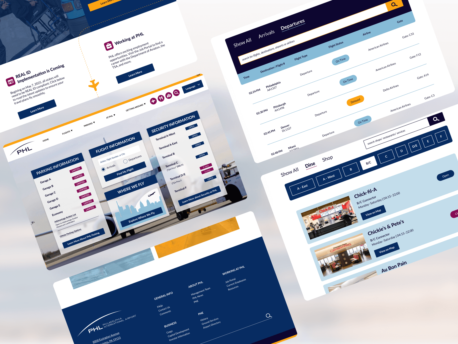
Transform the Philadelphia International Airport website to enhance user experience, accessibility, and satisfaction. We redesigned the navigation for simplicity, modernized the visual design, optimized responsiveness for mobile devices, and ensured accessibility for all users. The goal was to create a user-centric platform that aligns with industry standards, elevating the airport's online presence and user engagement.
Design Process:
I conducted comprehensive user research, including stakeholder interviews, usability testing, user surveys, card sorting and competitive analysis. By consolidating and analyzing the results, I made data-driven design decisions to enhance the site and create a more intuitive and satisfying user experience.
Usability Testing
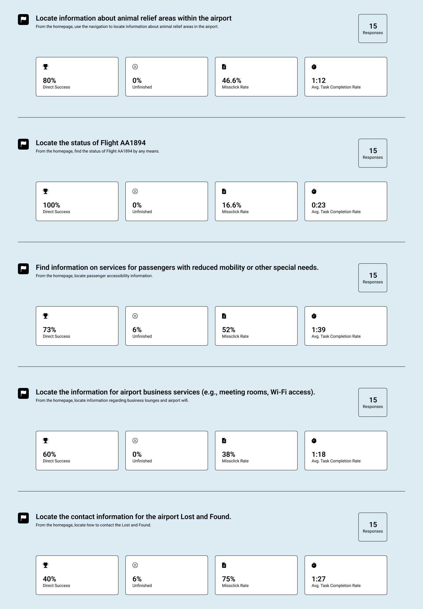
Usability testing revealed that while task completion rates for the main navigation were high, the time taken to find key information, such as accessibility for disabled passengers, animal relief areas, and details about Wi-Fi and business lounges, was longer than expected. Additionally, a high rate of misclicks indicated that the paths to these pages were not intuitively clear, highlighting the need for improved navigation clarity.
User Survey
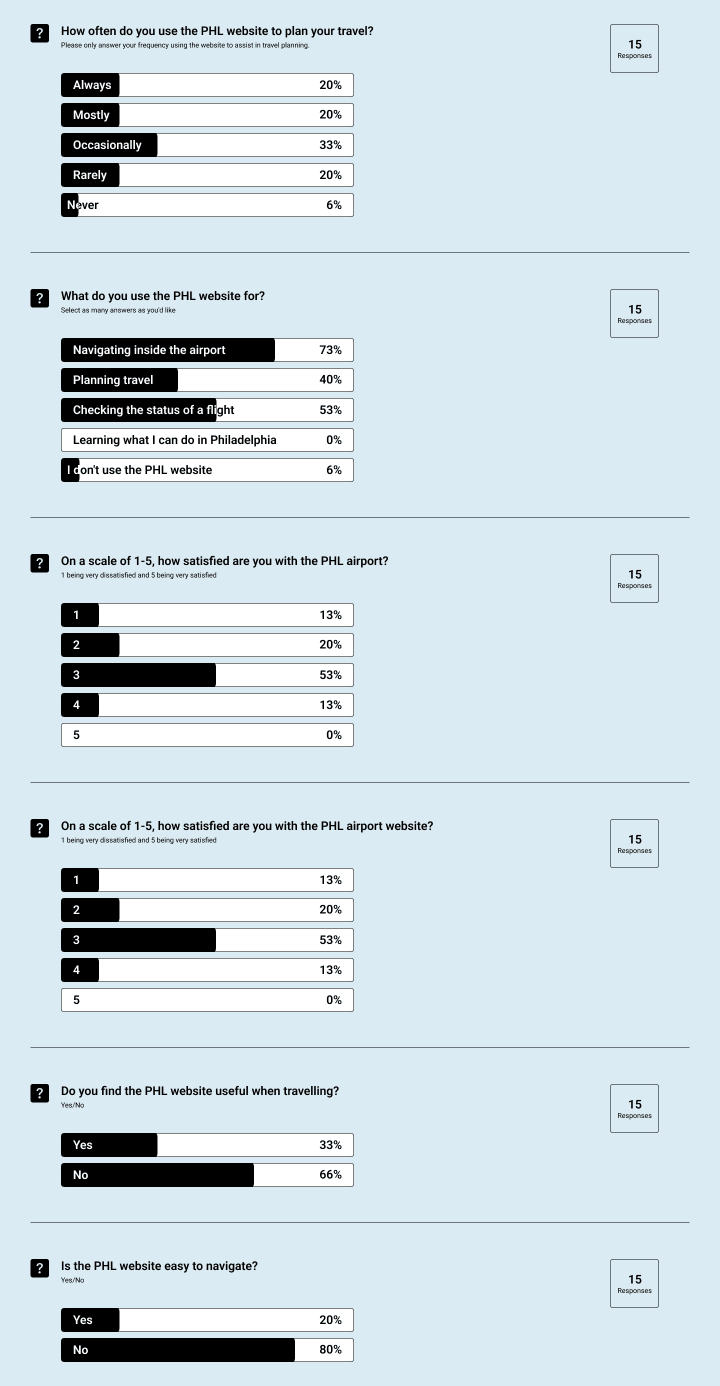
The user survey revealed that 80% found the website difficult to navigate, 66% deemed it unhelpful for travel, and only 13% were slightly satisfied with their experience. To address these issues, I planned an Information Architecture overhaul to improve navigation and revised the content strategy to ensure crucial information is easily accessible on the homepage.
SWOT Analysis
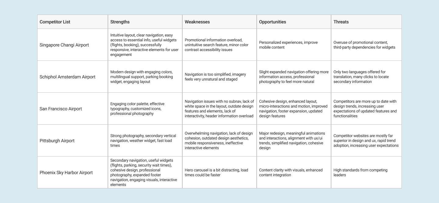
The SWOT analyses reveal that while our competitors have strengths such as cohesive design elements, useful widgets, and professional photography, they also struggle with overwhelming navigation, lack of cohesion, and outdated design elements. To capitalize on these insights, my redesign will prioritize intuitive navigation with simplified links and well-organized sub-navigation, modernize the overall aesthetic with cohesive color schemes and typography, and integrate meaningful animations and micro-interactions that enhance user engagement. By focusing on clear content presentation and ensuring visuals support rather than distract from key information, I aimed to create a user experience that is both visually appealing and highly functional, setting PHL apart from industry leaders.
Card Sorting
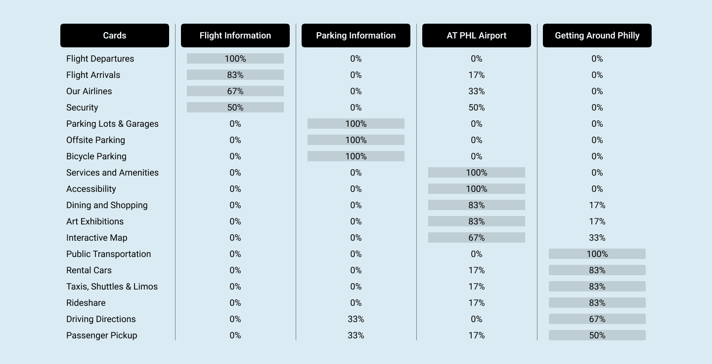
The first clear improvement was the main navigation. I identified essential content and performed card sorting exercises with users and stakeholders to organize the navigation in a user-centered manner.
Information Architecture
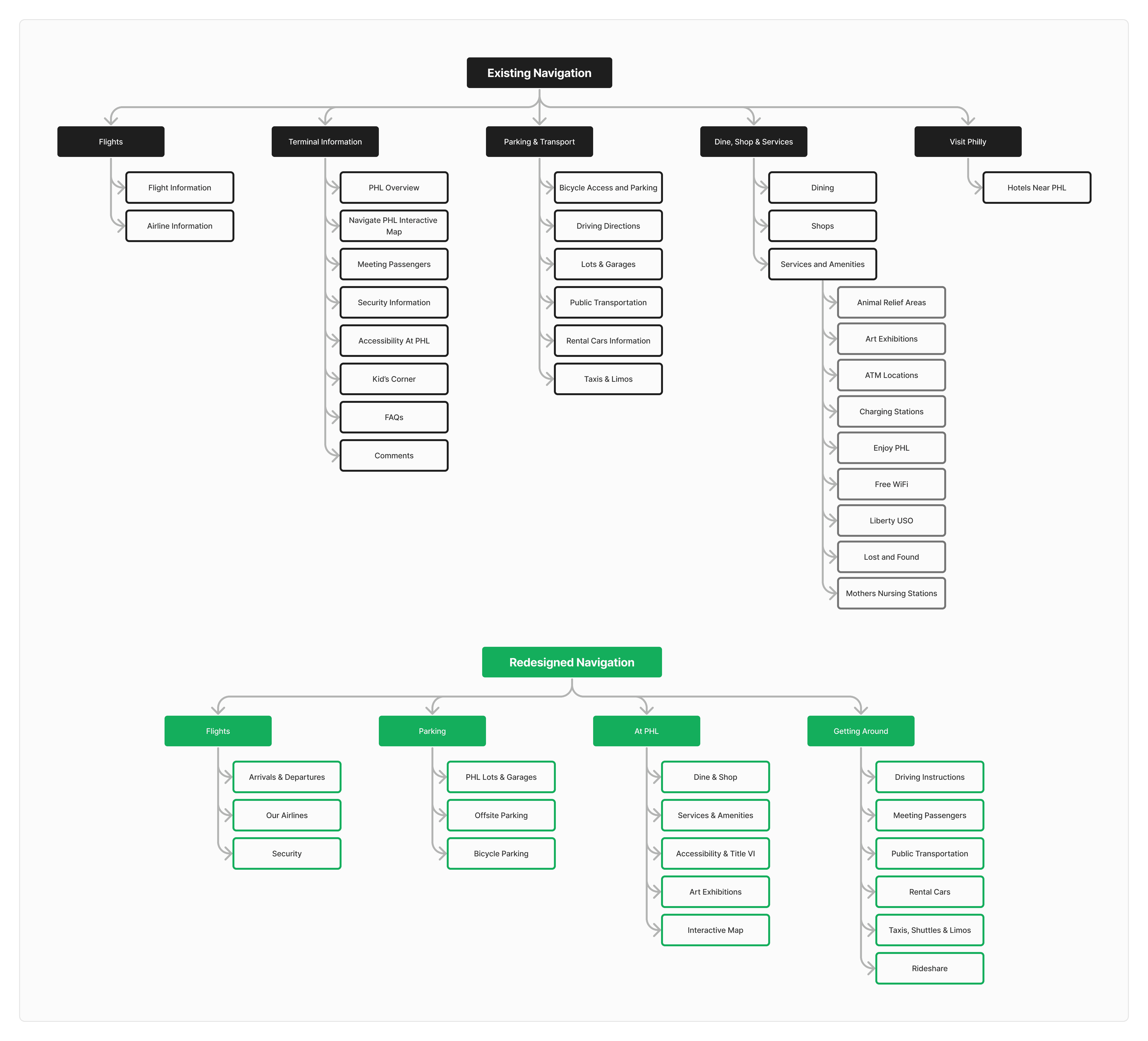
The original navigation had 34 links, which users found cluttered and overwhelming; my redesigned information architecture reduced this to 21 links, based on card sorting data.
Wireframes
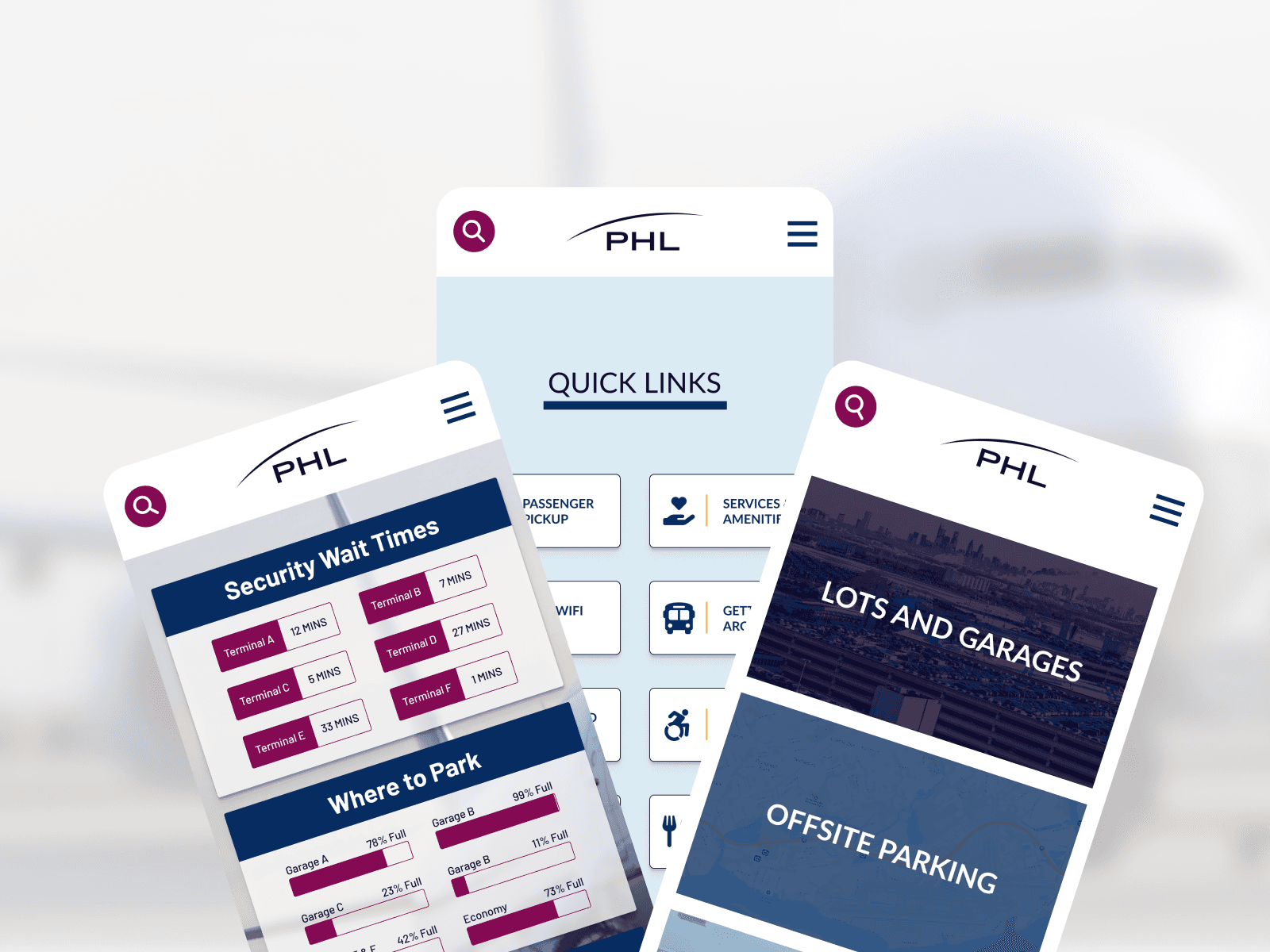
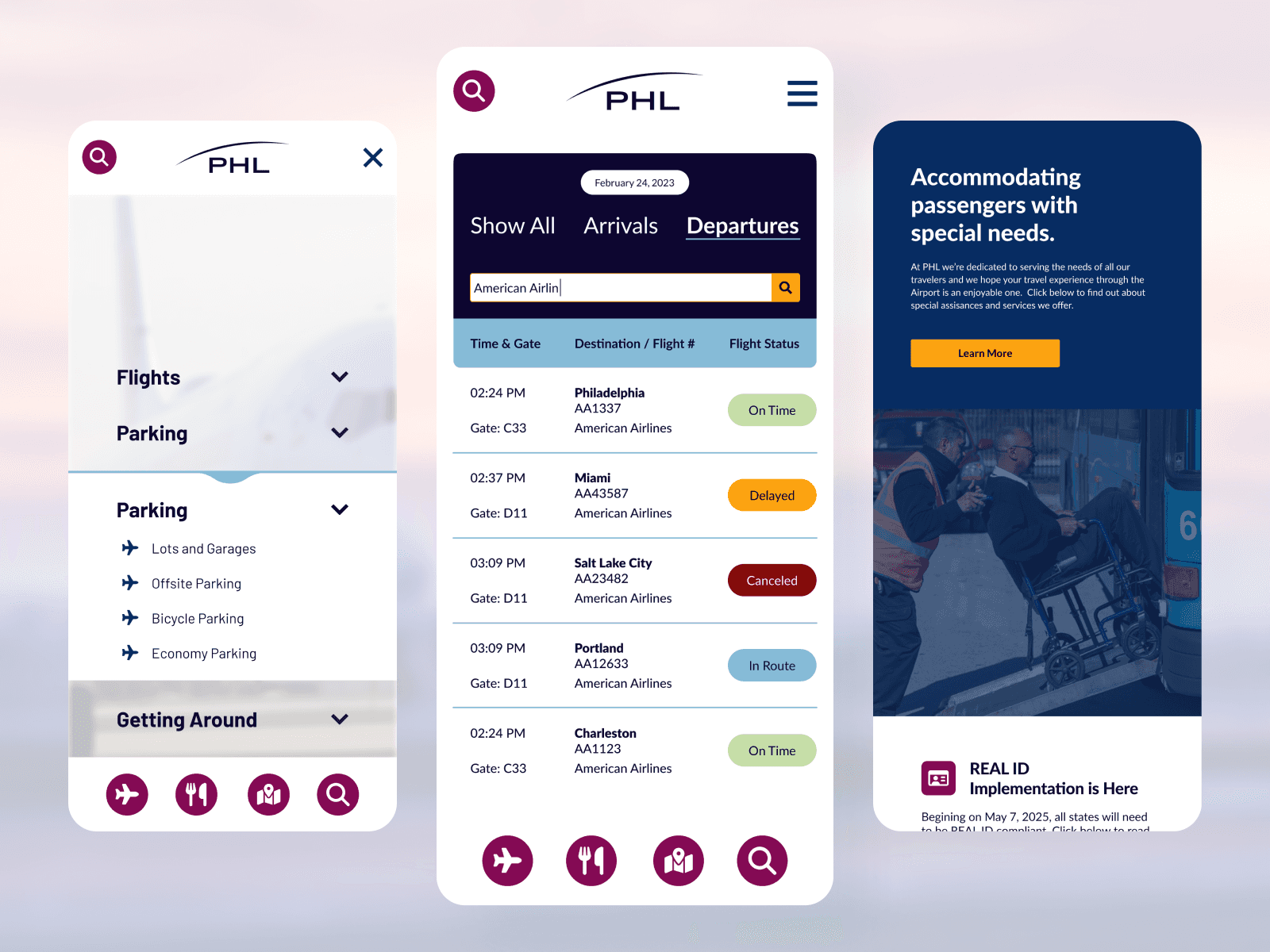
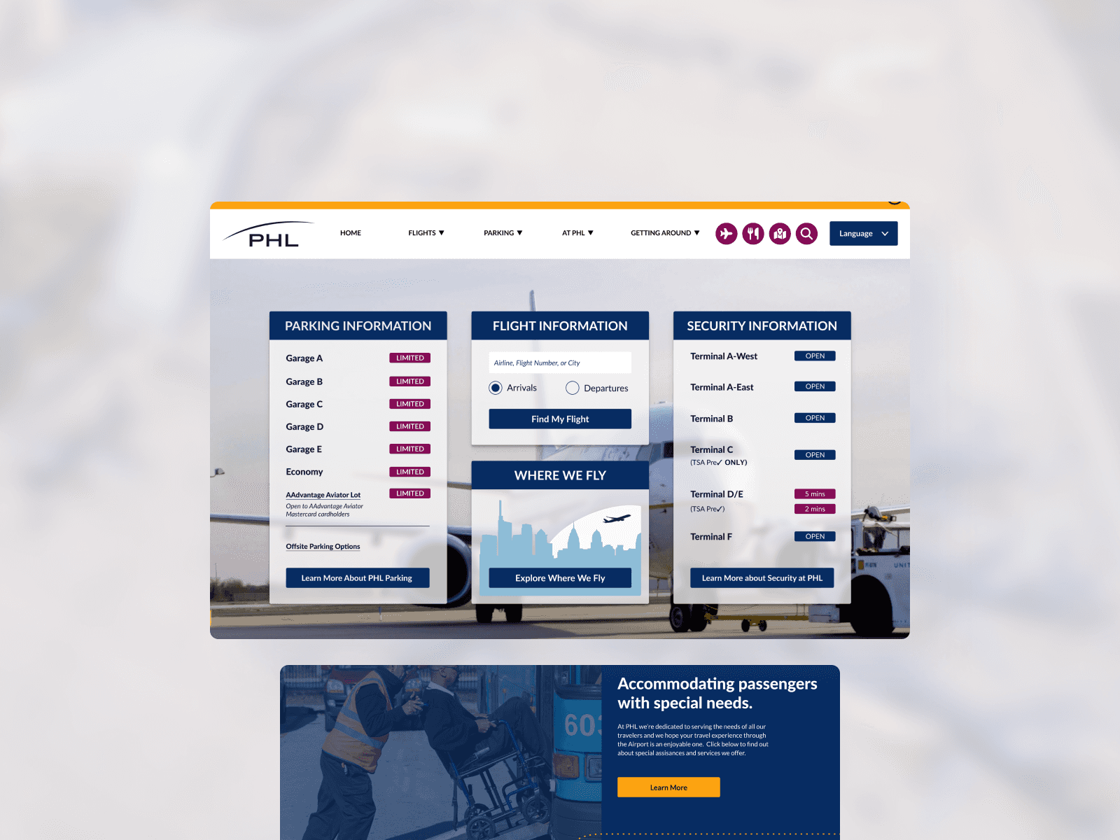
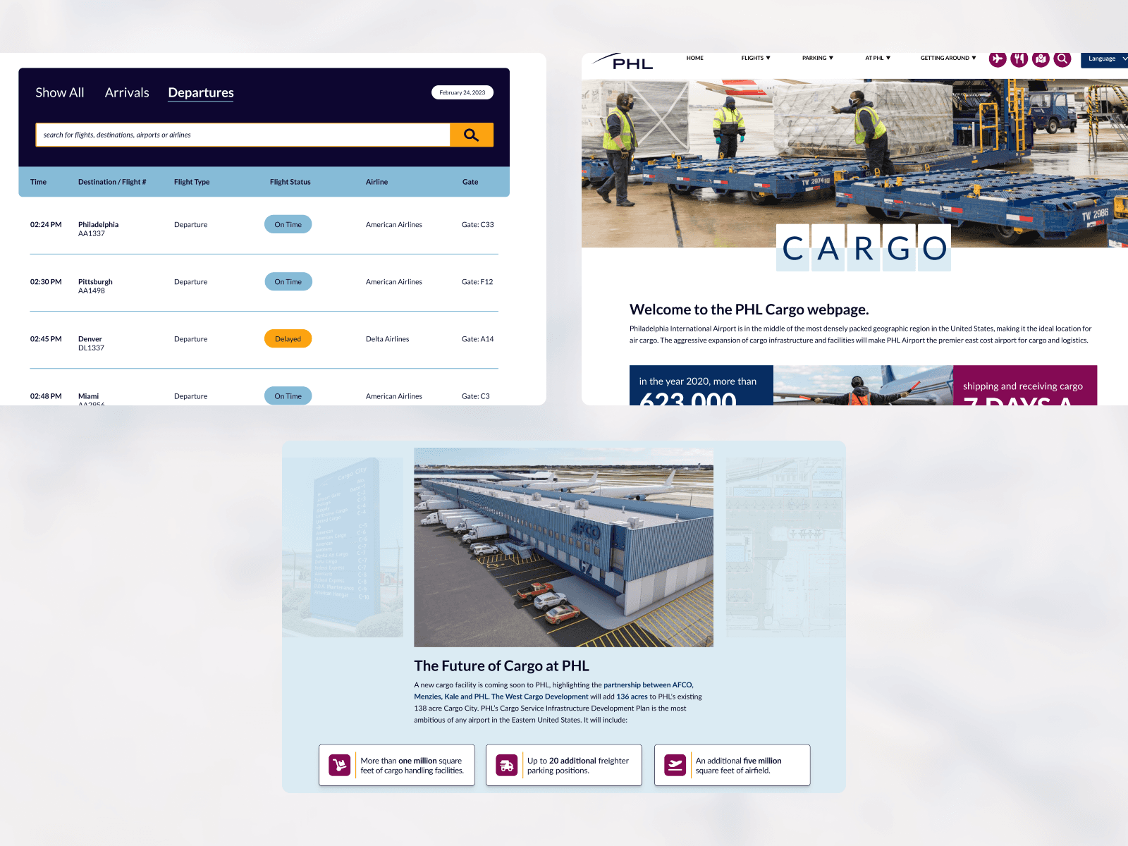
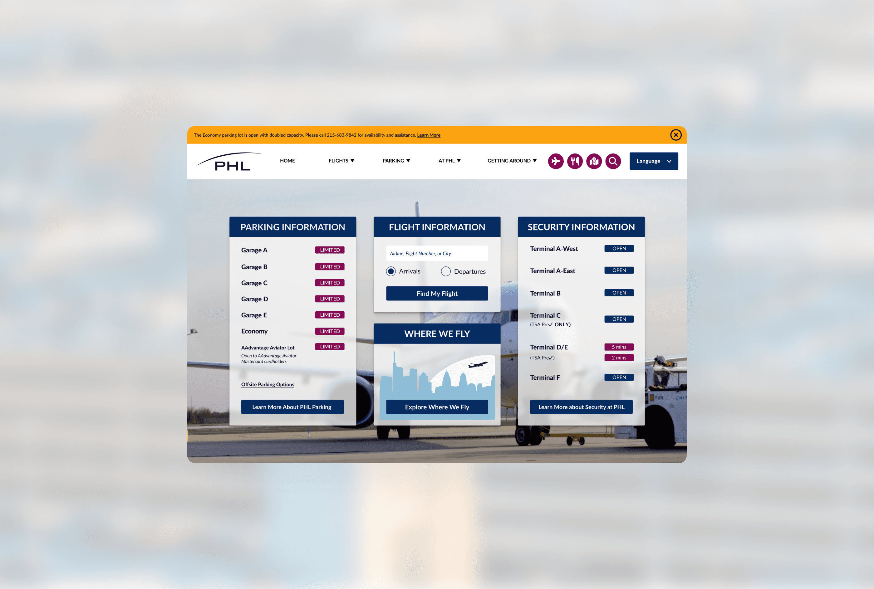
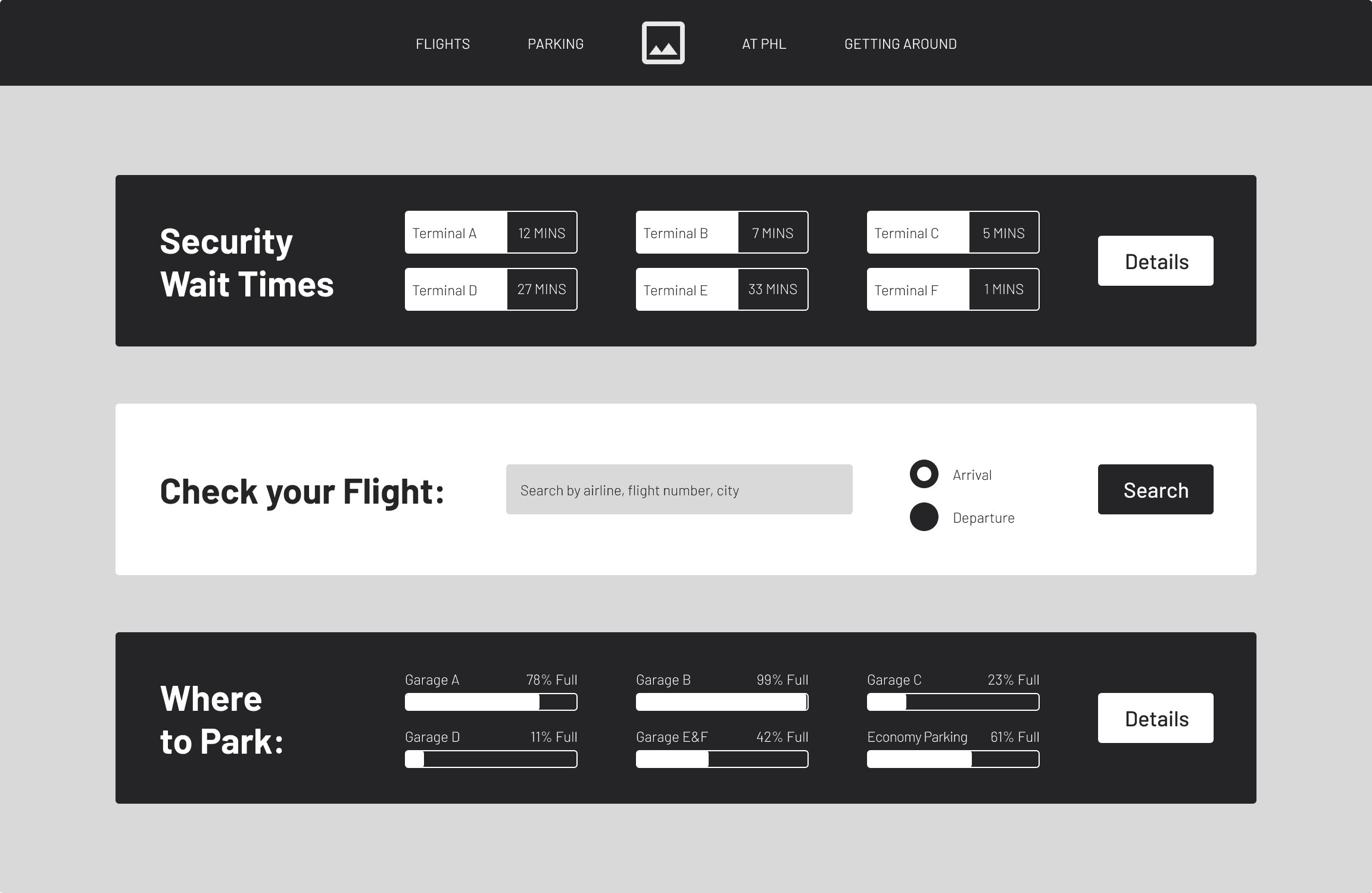
The SWOT analysis highlighted the importance of integrating widgets for a seamless user experience, a common feature among top competitors. Guided by this insight, I proposed incorporating key features such as a flight search/flight feed, real-time parking data, and real-time security wait times. These additions, driven by user requests, aim to provide essential information and enhance overall usability.
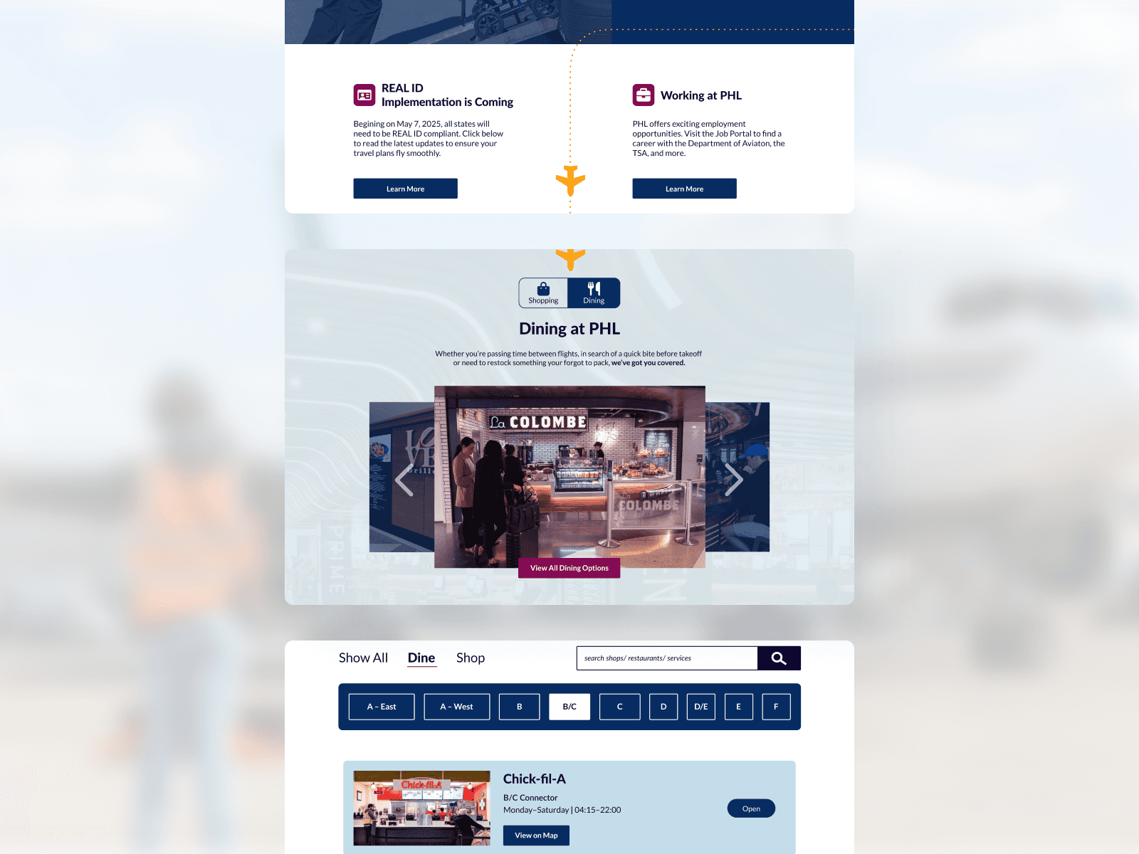
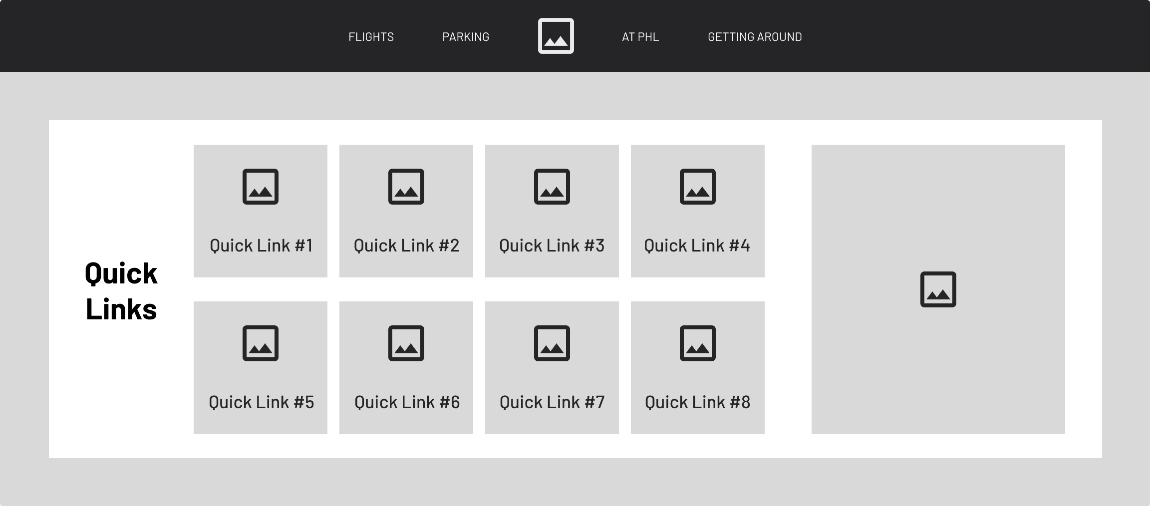
The SWOT analysis also revealed that stakeholders favored implementing a secondary navigation to keep the main navigation clean yet accessible. To address this without merely copying competitors, I proposed a Quick Links section on the homepage. This section features custom icons, micro-interactions, and animations, offering an interactive and engaging way for users to access important information, setting this site apart from many competitors and aligning us with industry leaders.
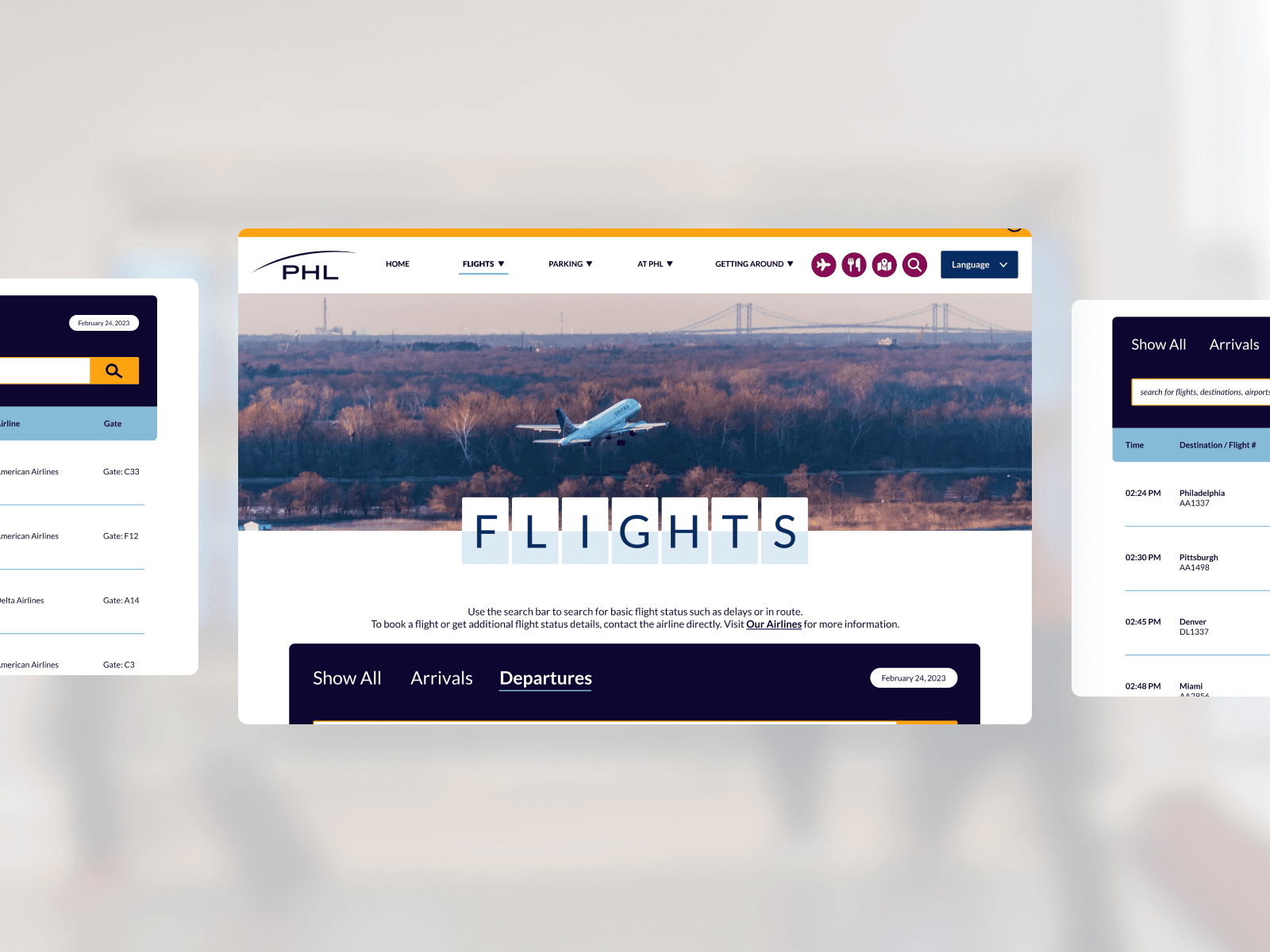
The final major feature I implemented focused on navigation, opting for a clean, sleek, and minimal design. This approach makes finding essential information quicker and reduces visual overload. By keeping sub-navigation items to a single line, I created a visually calming and easily understandable layout. This redesign, informed by my research and competitor analysis, effectively addresses all the issues present in the existing navigation.

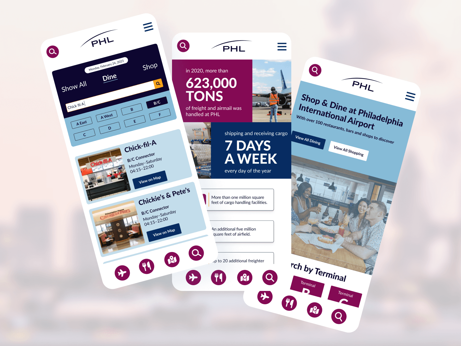
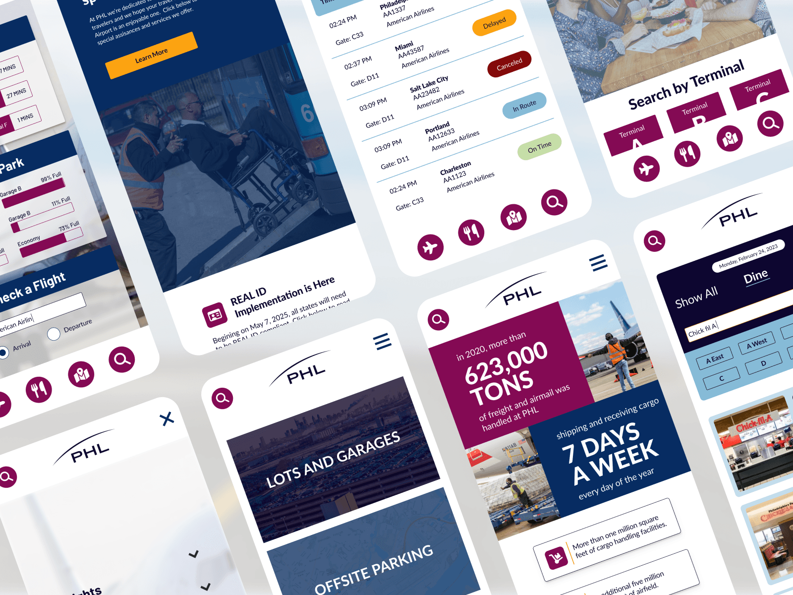
While building these solutions, I adopted a mobile-first approach, as the majority of the users access the site from mobile devices. Each major feature was designed for various screen sizes, ensuring responsiveness and usability across all devices. This approach guarantees that the website remains functional and user-friendly, regardless of how users access it.

Style Guide
With stakeholder buy-in, I began building a comprehensive style guide to establish a strong design direction and ensure cohesiveness throughout the site. User research and competitive analysis highlighted the importance of a cohesive design. Initially, I planned to create an extensive design system, but due to budget constraints, I opted for a less comprehensive style guide. This guide served as the foundation for all designs and was frequently referenced to maintain design consistency and cohesiveness.

