Industry :
Public Sector
Duration :
1 Year
My Role :
UX/UI Designer
Problem Statement
The redesign of the 21APR afterschool management software aimed to address challenges such as data accuracy issues, slow performance, and a non-intuitive user interface. Through extensive user research, the goal was to enhance reporting workflows, improve user experience and functionality, and update the visual design to align with industry standards, ultimately ensuring a more efficient and user-friendly experience for program directors and stakeholders.
Solution
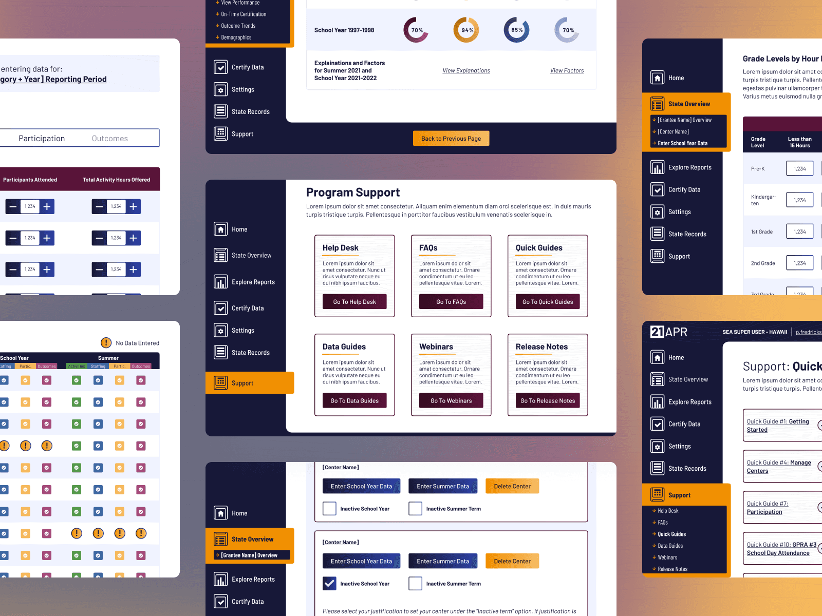
The solution involved streamlining key task flows, rebuilding the information architecture, and enhancing accessibility scores to improve user satisfaction. By optimizing reporting workflows, reducing loading times, and ensuring data accuracy, the redesigned 21APR software provided a more intuitive and efficient experience for program directors and stakeholders. Additionally, updating the visual design to industry standards enhanced the overall user experience.
Design Process:
The design process began with stakeholder interviews and user surveys to gather insights into user needs and pain points. Usability testing of the existing product helped identify key areas for improvement. Task flows and user flows were then refined to enhance navigation and streamline workflows. Information architecture was redesigned for better organization and accessibility. Concurrently, a style guide was developed to ensure visual consistency and adherence to industry standards. Wireframing and prototyping iteratively translated design concepts into interactive interfaces, allowing for user feedback and refinement throughout the process.
Stakeholder Interviews
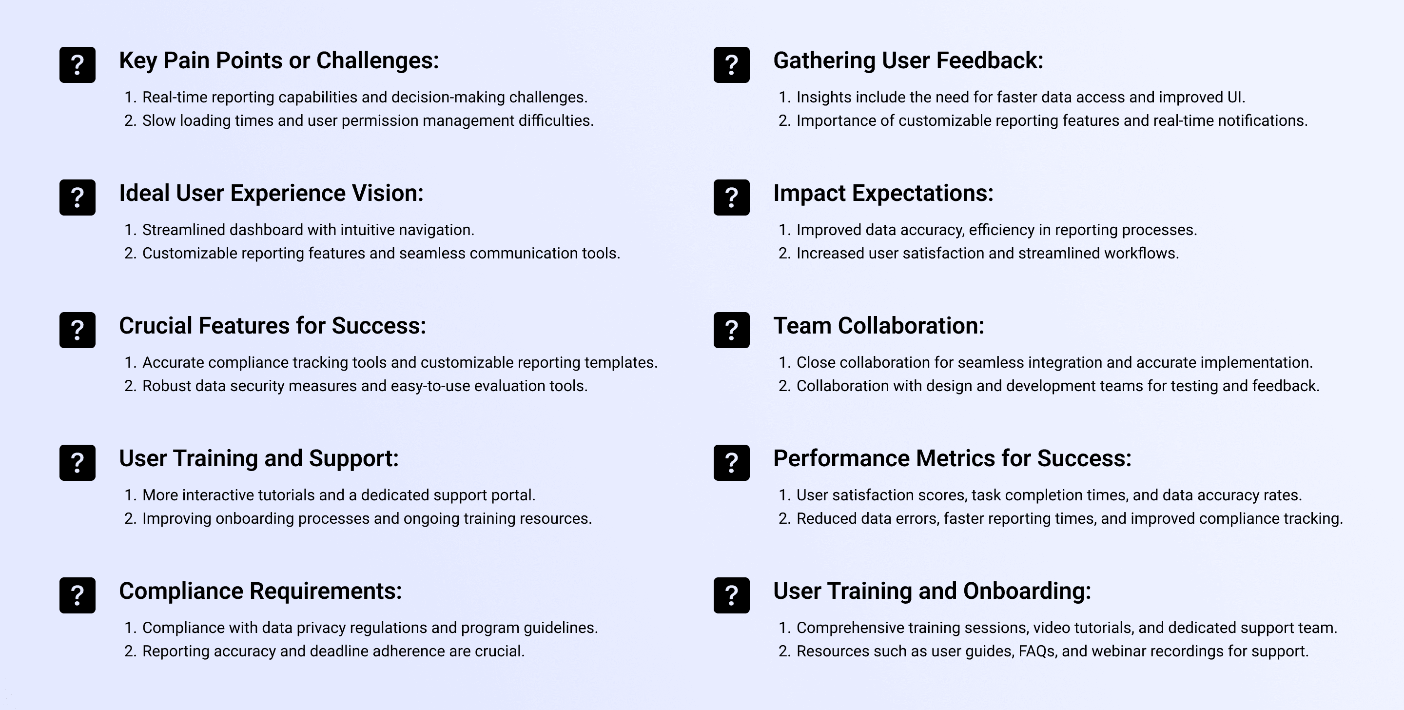
The Stakeholder Interview process for the 21APR software redesign involved engaging with a diverse group of internal and external stakeholders, including product owners, subject matter experts, admins, program directors, and evaluators. The UX team aimed to gather valuable insights into the current pain points, user needs, compliance requirements, and expectations for the redesigned software. Through a series of structured interviews, the team sought to understand stakeholder perspectives, align on project goals and priorities, and inform the design decisions to ensure the redesigned software would meet user expectations, improve efficiency, and enhance overall user satisfaction.
User Survey
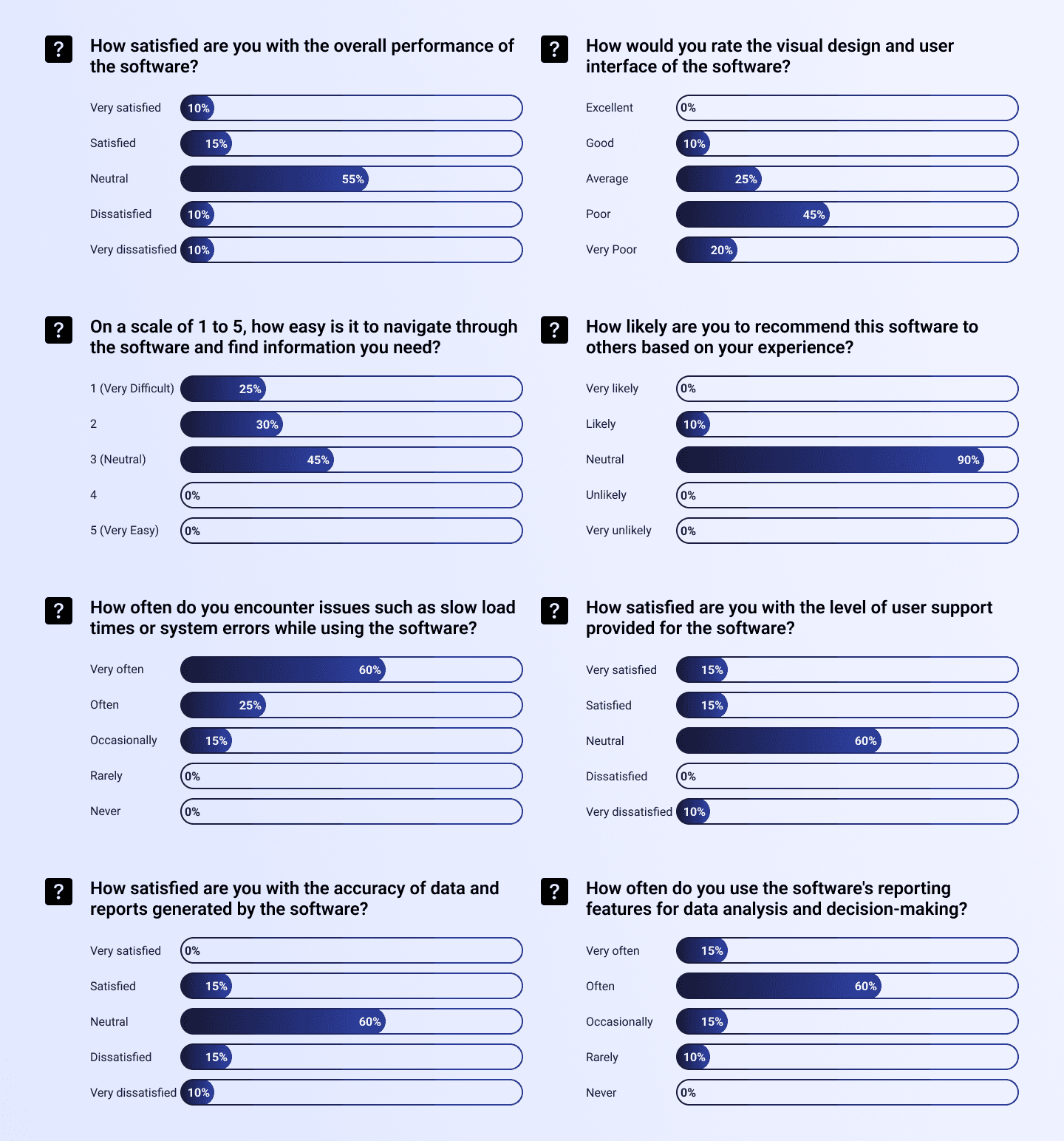
The User Survey process involved distributing a structured questionnaire to gather quantitative data on user satisfaction, usability, performance, and overall experience with the existing software. We aimed to capture insights into user pain points, satisfaction levels with key features, and areas for improvement. Post-launch, we planned to run the same survey to measure the impact of the redesign, identify any new challenges or improvements, and gather feedback for continuous enhancement of the software's user experience.
Usability Testing (Existing Product)
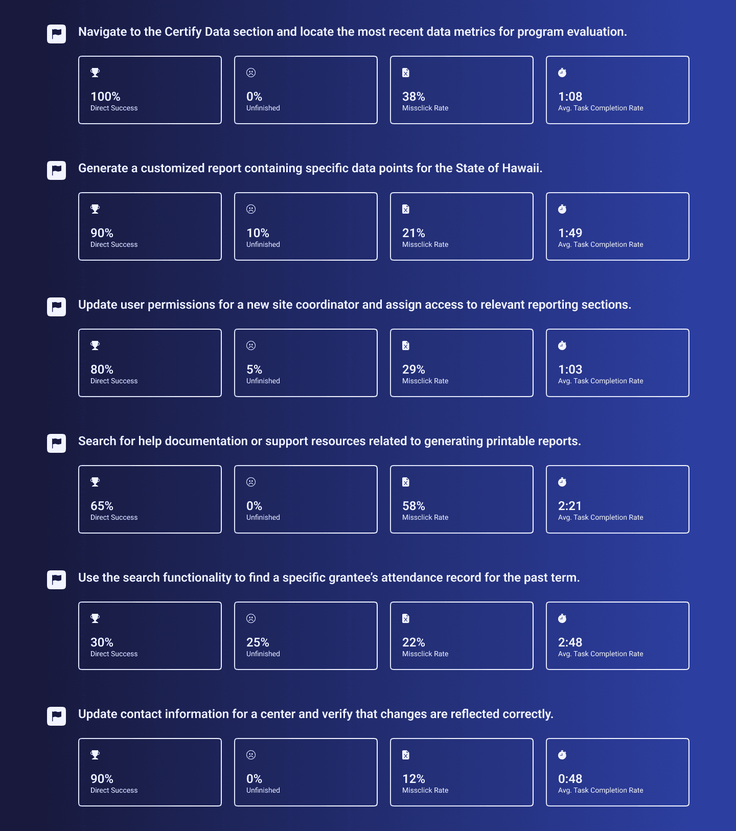
The usability testing process aimed to uncover pain points and inefficiencies by having users perform a series of real-world tasks within the software. Although the success rates were mostly high, task completion times were lengthy, revealing that users took a long time to complete simple, common tasks. We conducted these tests to identify usability issues and plan to repeat the testing post-launch to measure improvements and ensure a more efficient user experience.
Task Flow Development
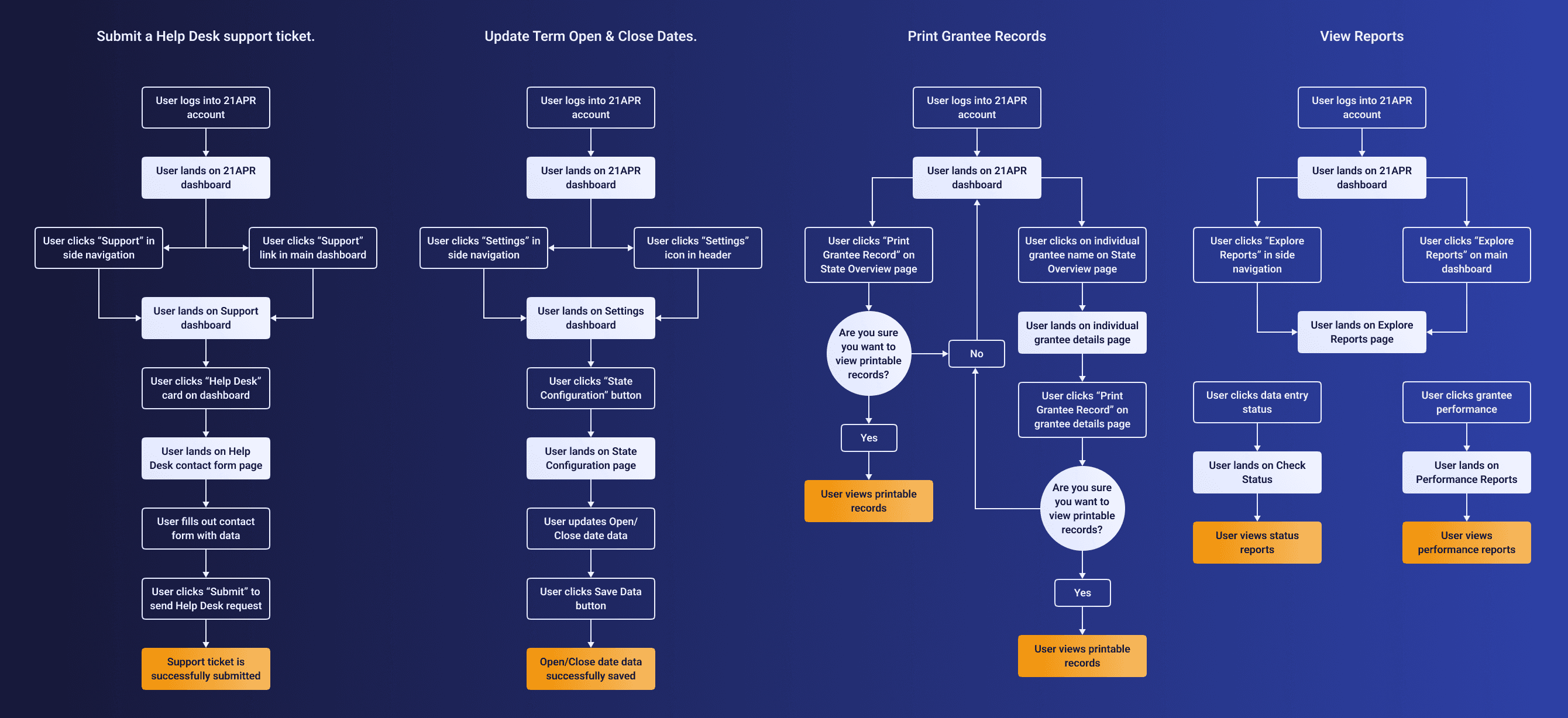
The process of identifying key task flows involved analyzing the steps users take to complete essential tasks within the software, focusing on areas with lengthy completion times and low success rates. By mapping out these task flows, we pinpointed inefficiencies and restructured the steps to be more intuitive and streamlined. This improvement aimed to decrease task completion time and increase overall task success rates, enhancing the user experience.

Information Architecture
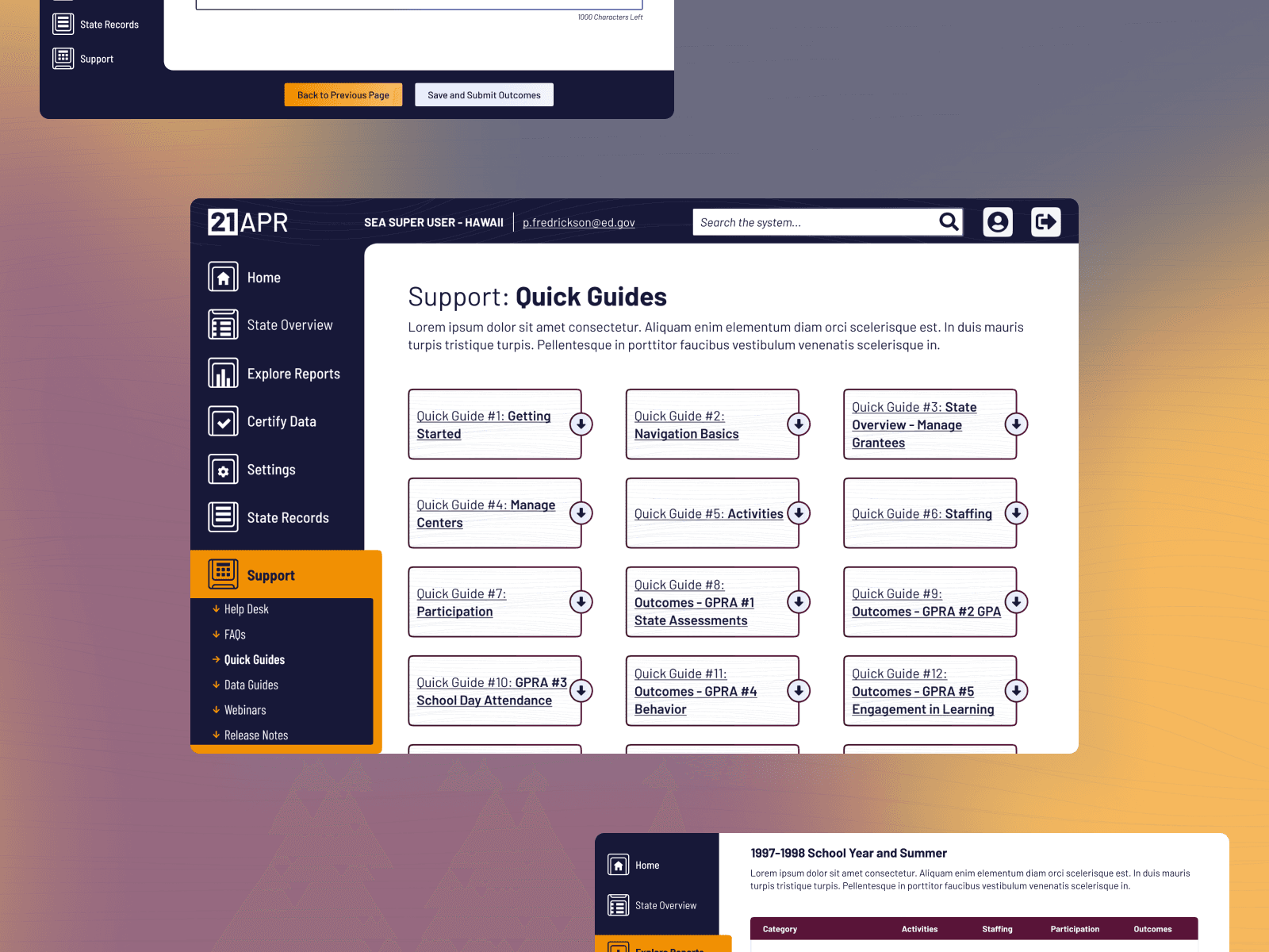
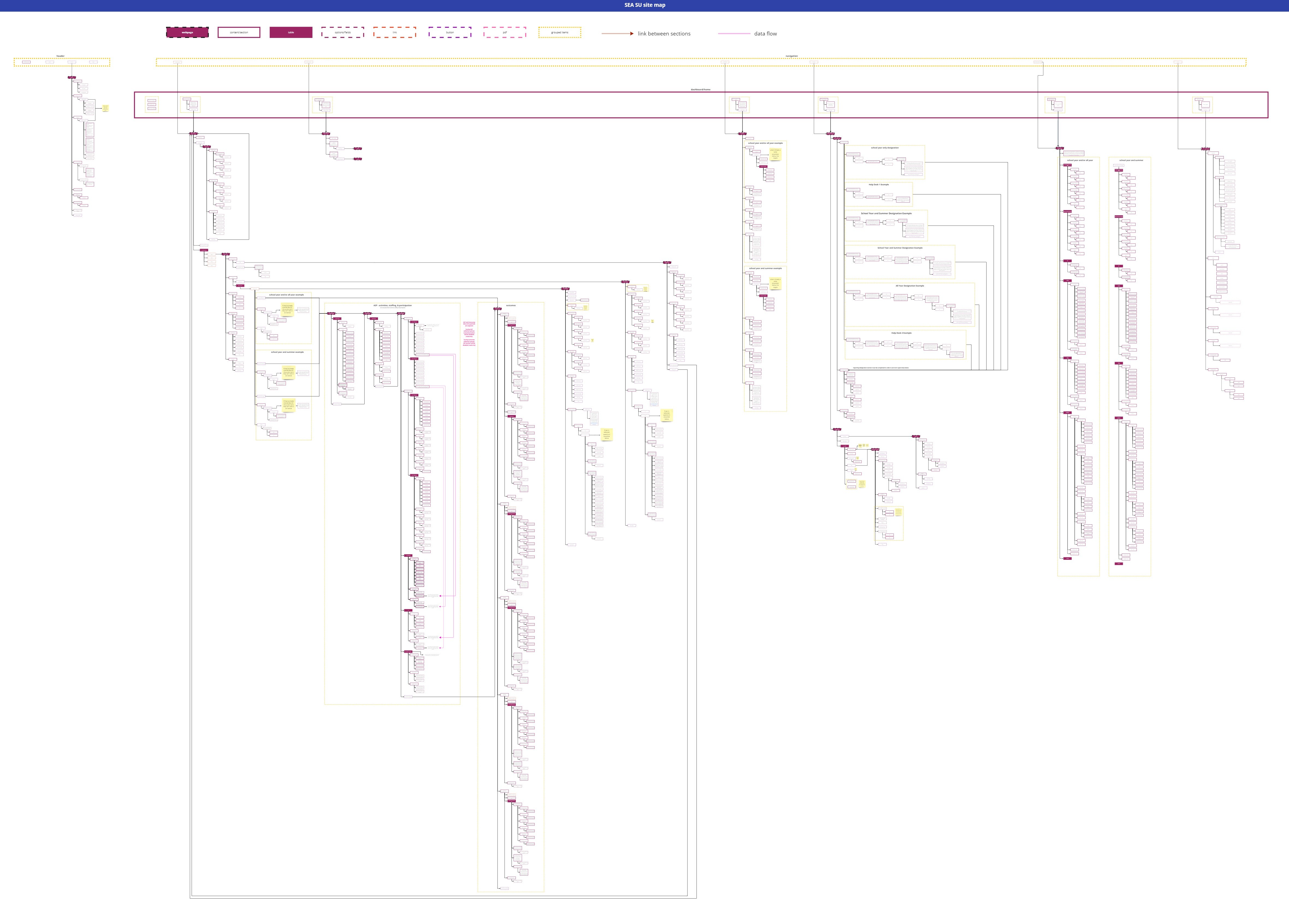
Overhauling the information architecture of the site involved a comprehensive analysis of the existing content structure and user workflows. We reorganized the software's content to create a more intuitive and meaningful layout, making it easier for users to navigate and find relevant information. This restructuring aimed to provide users with a seamless workflow, enabling them to report their data more smoothly, accurately, and quickly.
Style Guide
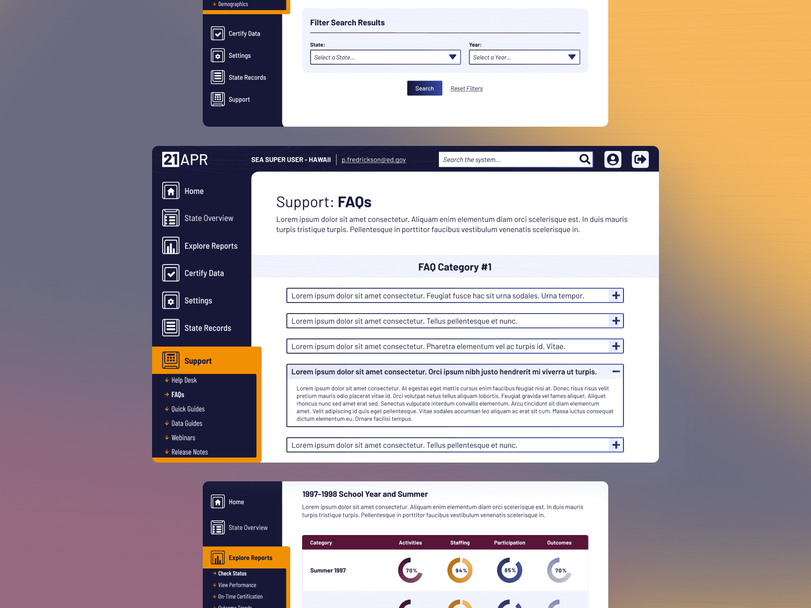
To streamline the development process due to budget and time constraints, we opted out of building wireframes for this large-scale project and focused on creating a comprehensive style guide. This style guide ensured the software's design adhered to trending aesthetics and compliance requirements while providing clear guidelines on typography, color schemes, iconography, and UI components. By establishing a well-thought-out style guide, we defined the design direction for the entire product, ensuring consistency and efficiency throughout the build.

Prototypes
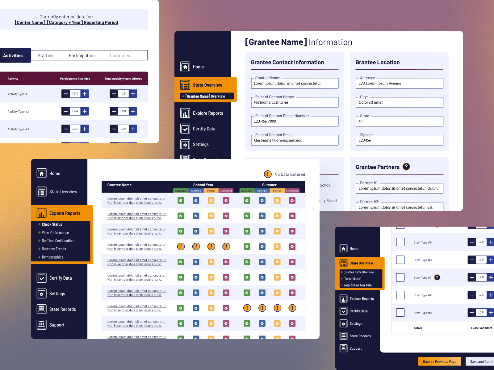
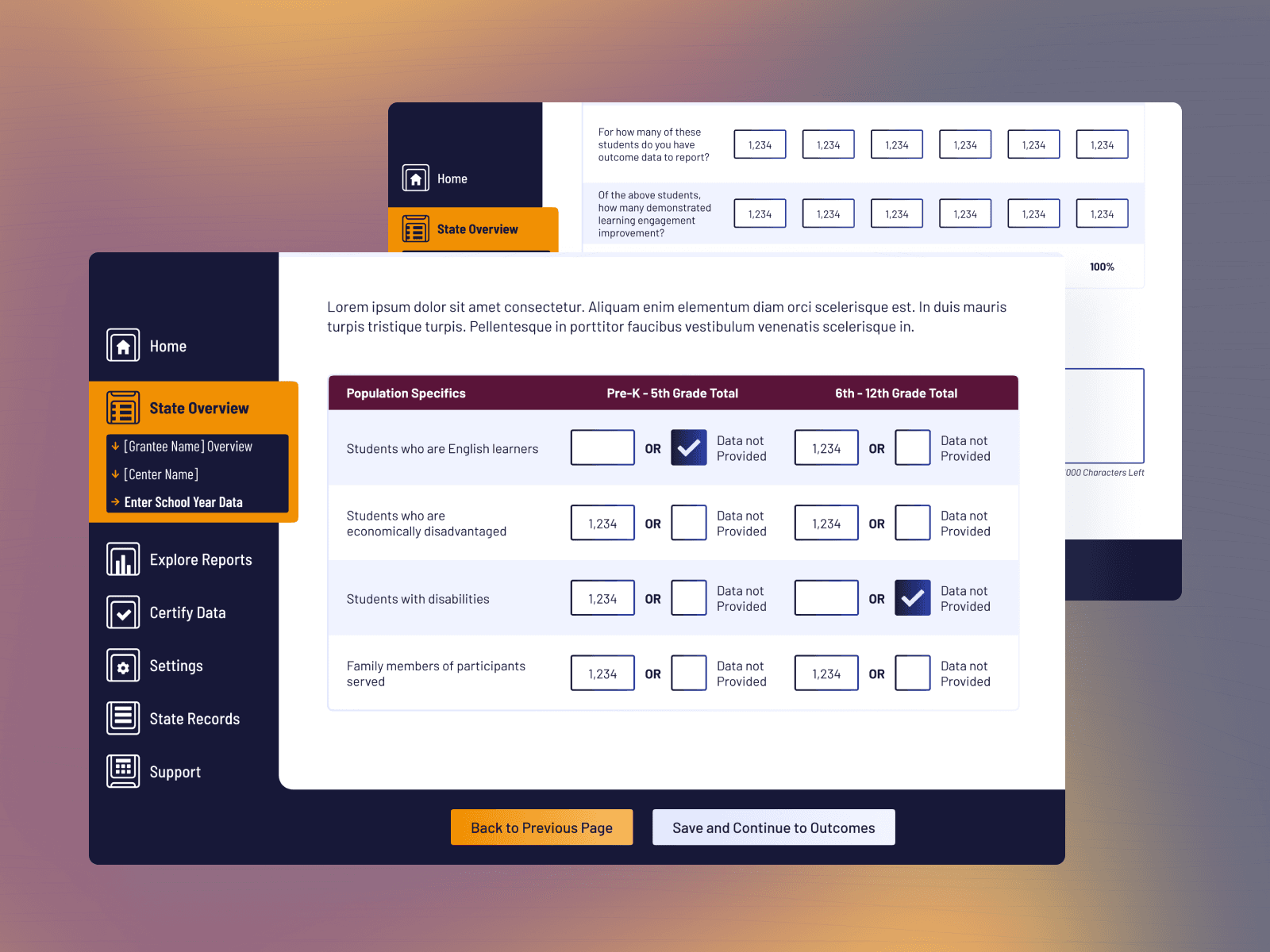
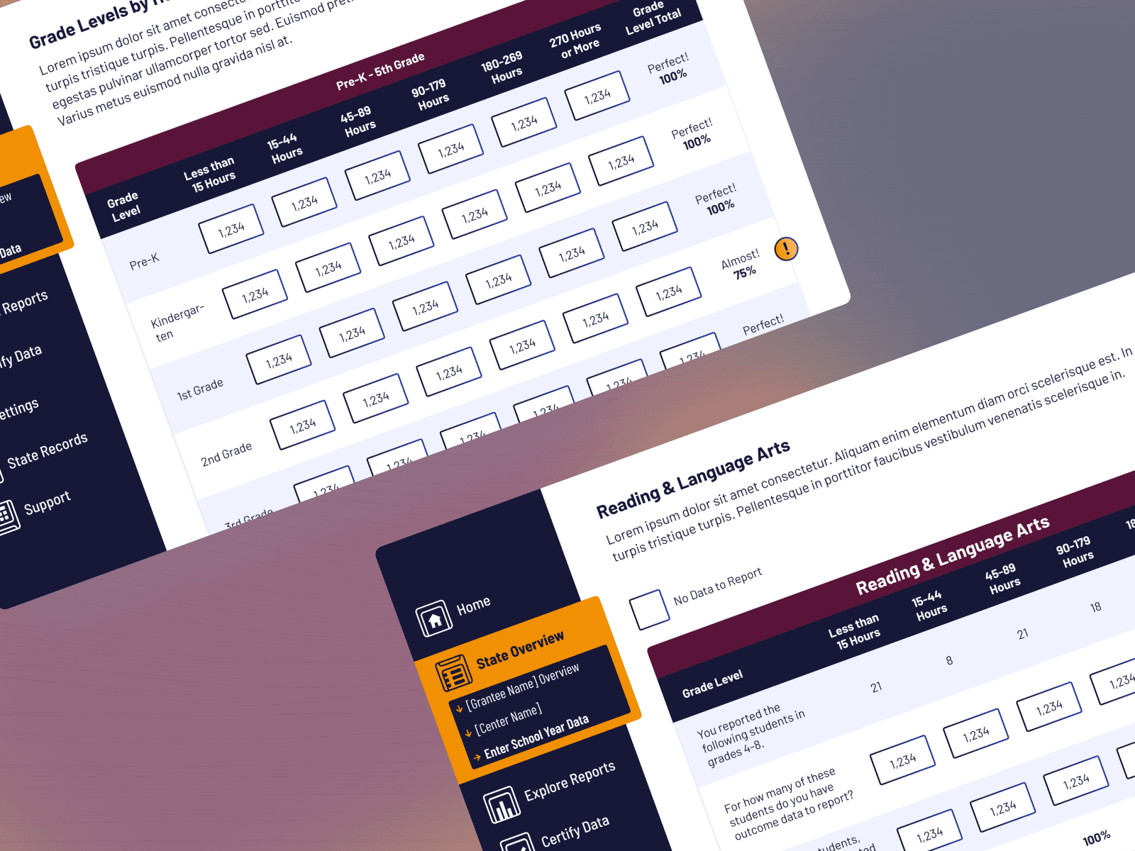
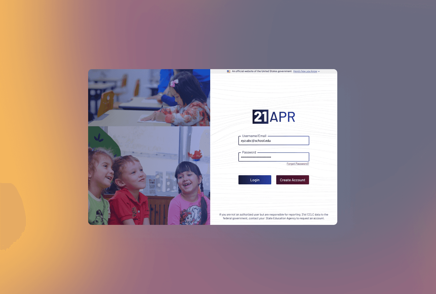
During the prototyping phase, we integrated the feedback from our user research exercises to refine and enhance our designs. We created high-fidelity prototypes using Figma, ensuring that each design iteration addressed specific user pain points identified during usability testing, such as streamlining the process for generating customized reports and updating user permissions. By continuously testing these prototypes with users and gathering their feedback, we made iterative adjustments to improve usability and ensure the final design provided a seamless and efficient user experience.
